DaisyRadio
Overview
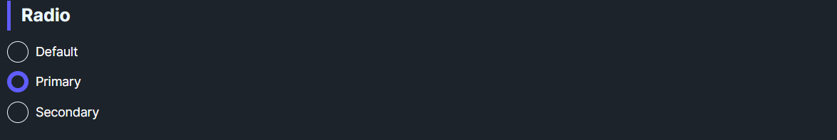
DaisyRadio is a styled RadioButton with 8 color variants and 5 size presets. It shows a filled inner circle when checked and supports standard radio grouping via GroupName. Use variants for semantic meaning or brand alignment in forms and option groups.
Variant Options
| Variant |
Description |
| Default |
Neutral fill when checked. |
| Primary / Secondary / Accent |
Brand-aligned fills. |
| Success / Warning / Info / Error |
Semantic fills for status or validation. |
Size Options
| Size |
Outer |
Inner |
Use Case |
| ExtraSmall |
16px |
8px |
Dense tables/toolbars. |
| Small |
20px |
12px |
Compact forms. |
| Medium (default) |
24px |
14px |
General usage. |
| Large |
32px |
20px |
Spacious layouts or touch targets. |
| ExtraLarge |
Falls back to Medium styling (no explicit theme overrides). |
Quick Examples
<!-- Basic group -->
<StackPanel Spacing="6">
    <controls:DaisyRadio Content="Option A" GroupName="demo" />
    <controls:DaisyRadio Content="Option B" GroupName="demo" IsChecked="True" />
</StackPanel>

<!-- Semantic variants -->
<controls:DaisyRadio Content="Success" Variant="Success" GroupName="status" />
<controls:DaisyRadio Content="Error" Variant="Error" GroupName="status" />

<!-- Compact radios -->
<controls:DaisyRadio Content="Small" Size="Small" GroupName="sizeDemo" IsChecked="True" />
<controls:DaisyRadio Content="XS" Size="ExtraSmall" GroupName="sizeDemo" />
Tips & Best Practices
- Always set
GroupName for mutually exclusive choices; Avalonia handles exclusivity within a group.
- Align size with neighboring inputs; use Small/XS for dense forms, Large for mobile-friendly layouts.
- Use semantic variants to indicate consequence (e.g., Error for destructive choices).
- Keep labels short; adjust
Padding if you customize spacing.