DaisyRange
Overview
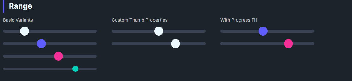
DaisyRange is a styled slider with 8 color variants, 4 size presets, and customizable thumb/track colors. It exposes thumb size and optional progress fill properties while inheriting standard Slider behavior for Minimum, Maximum, and Value.
Variant Options
| Variant |
Description |
| Default |
Neutral thumb/track. |
| Primary / Secondary / Accent |
Brand-aligned thumb colors. |
| Success / Warning / Info / Error |
Semantic thumb colors. |
Size Options
| Size |
Track Height |
Thumb Size |
| ExtraSmall |
4 |
16 |
| Small |
6 |
20 |
| Medium (default) |
8 |
24 |
| Large |
12 |
32 |
Additional Styling
| Property |
Description |
ThumbBrush |
Color of the thumb. |
ThumbSize |
Diameter of the thumb (default 24). |
ProgressBrush |
Color for filled track (left side). |
ShowProgress |
Toggle displaying the filled portion (theme groundwork present). |
Quick Examples
<!-- Basics -->
<controls:DaisyRange Value="40" Maximum="100" />
<controls:DaisyRange Value="60" Maximum="100" Variant="Primary" />
<controls:DaisyRange Value="20" Maximum="100" Variant="Secondary" Size="Large" />

<!-- Compact accent -->
<controls:DaisyRange Value="80" Maximum="100" Variant="Accent" Size="ExtraSmall" />

<!-- Custom thumb -->
<controls:DaisyRange Value="50"
                     ThumbSize="28"
                     ThumbBrush="{DynamicResource DaisySuccessBrush}"
                     ProgressBrush="{DynamicResource DaisySuccessBrush}"
                     ShowProgress="True" />
Tips & Best Practices
- Match
Size to surrounding inputs; Smaller for dense forms, Large for touch-friendly layouts.
- Use semantic variants to convey meaning (e.g., Error for risk settings).
- Set
ShowProgress=True and ProgressBrush to highlight completed range segments.
- Keep
Minimum < Maximum; bind Value for reactive UI updates.