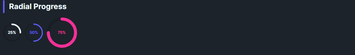
DaisyRadialProgress is a circular progress indicator with 8 color variants, 3 size presets, and configurable stroke thickness. It inherits RangeBase for Minimum, Maximum, and Value, converting the range to a 0–360° sweep. Shows a percentage label by default.
Uses DaisyProgressVariant: Default, Primary, Secondary, Accent, Info, Success, Warning, Error (foreground changes).
| Size | Diameter | Thickness | Label Font |
|---|---|---|---|
| Small | 32 | 3 | 8 |
| Medium (default) | 48 | 4 | 10 |
| Large | 80 | 8 | 14 |
<!-- Basic -->
<controls:DaisyRadialProgress Value="70" />

<!-- Themed and large -->
<controls:DaisyRadialProgress Value="30" Variant="Primary" />
<controls:DaisyRadialProgress Value="100" Variant="Accent" Size="Large" />

<!-- Custom thickness and range -->
<controls:DaisyRadialProgress Minimum="0" Maximum="250" Value="125" Thickness="6" />DaisyRadialProgress includes built-in accessibility for screen readers via the AccessibleText property. The automation peer automatically announces the current percentage along with the accessible text.
| Property | Type | Default | Description |
|---|---|---|---|
AccessibleText |
string |
"Progress" |
Context text announced by screen readers (e.g., "Upload progress, 70%"). |
<!-- Default: announces "Progress, 70%" -->
<controls:DaisyRadialProgress Value="70" />

<!-- Contextual: announces "Upload progress, 30%" -->
<controls:DaisyRadialProgress Value="30" AccessibleText="Upload progress" Variant="Primary" />

<!-- Contextual: announces "Battery level, 100%" -->
<controls:DaisyRadialProgress Value="100" AccessibleText="Battery level" Variant="Success" Size="Large" />Minimum < Maximum; default is 0–100.Thickness to match size; thicker strokes on Large keep the ring balanced.DaisyLoading variants instead; this control is determinate.AccessibleText to provide context about what the progress represents (e.g., "Storage used" or "Task completion").