DaisyDivider
Overview
DaisyDivider separates content with a line that can run horizontally (default) or vertically (Horizontal=True). It supports 10 visual styles, 9 color options, start/end placement, optional inline content, ornament decorations, and responsive sizing via the global Size system.
Visual Styles
| Style |
Description |
Solid (default) |
Simple single solid line |
Inset |
3D embossed dual-line effect (groove/ridge) |
Gradient |
Fades from full opacity at center to transparent at edges |
Ornament |
Line with decorative geometric shape in center (diamond, circle, star, square) |
Wave |
Curved/wavy line pattern |
Glow |
Neon-style glowing effect with soft blur |
Dashed |
Dashed line pattern - - - - |
Dotted |
Dotted line pattern • • • • |
Tapered |
Thick center tapering to thin points at ends |
Double |
Two parallel lines with gap |
Ornament Shapes
When using DividerStyle="Ornament", set the Ornament property:
| Ornament |
Description |
Diamond (default) |
Diamond shape ◆ |
Circle |
Circle shape ● |
Star |
4-point star shape ✦ |
Square |
Square shape ■ |
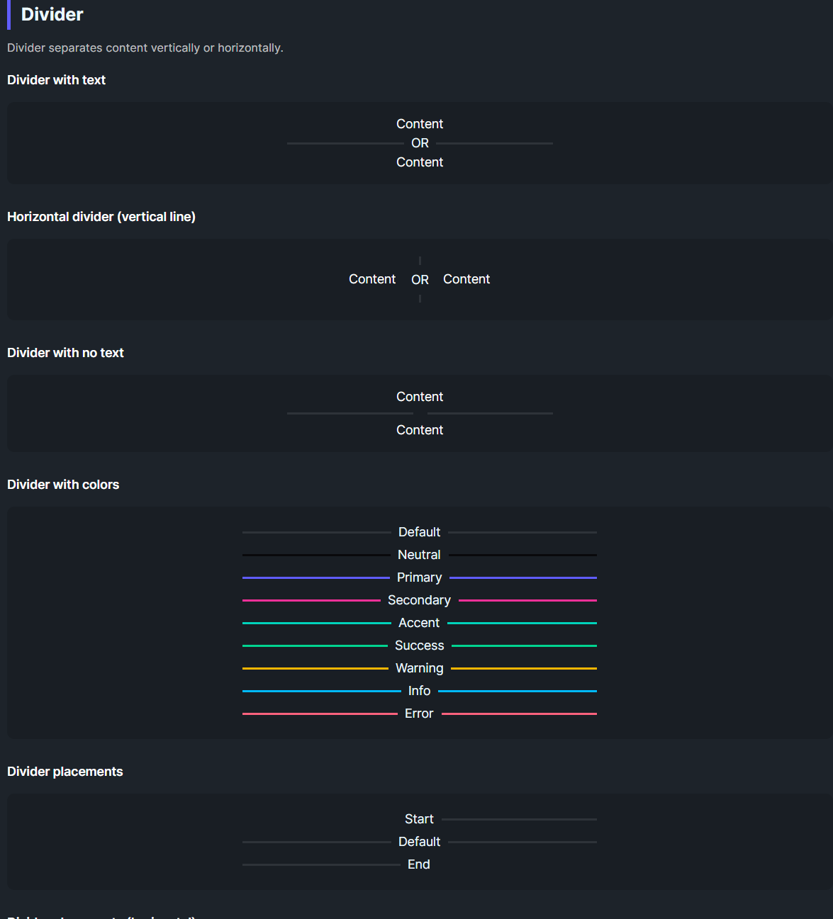
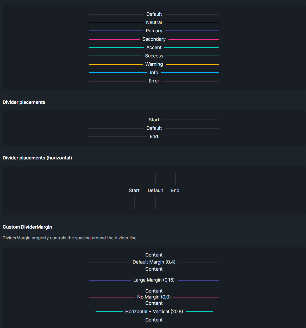
Orientation & Placement
| Option |
Description |
Horizontal=False (default) |
Renders a horizontal rule (line left/right). |
Horizontal=True |
Renders a vertical rule (line above/below). |
Placement=Start |
Positions content at the start of the line. |
Placement=End |
Positions content at the end of the line. |
Color Options
| Color |
Description |
| Default |
Subtle base-content line. |
| Neutral / Primary / Secondary / Accent / Success / Warning / Info / Error |
Solid colored line matching the Daisy palette. |
Layout & Sizing
| Property |
Description |
Thickness |
Line thickness in pixels. Default is 2. |
Size |
Controls font size, text padding, and margins. Follows FlowerySizeManager.CurrentSize by default. |
DividerText |
Text displayed in the center (or at placement position) of the divider. |
TextBackground |
Background brush for the text container. Set this to match parent container backgrounds (e.g., DaisyBase200Brush inside cards). Defaults to DaisyBase100Brush. |
Size Token Values
| Size |
Font Size |
Text Padding |
Margin |
| ExtraSmall |
9 |
8 |
2 |
| Small |
10 |
10 |
3 |
| Medium |
12 |
12 |
4 |
| Large |
14 |
16 |
6 |
| ExtraLarge |
16 |
18 |
8 |
Quick Examples
<!-- Basic divider with text -->
<controls:DaisyDivider DividerText="OR" />

<!-- Different styles -->
<controls:DaisyDivider DividerStyle="Solid" Color="Primary" />
<controls:DaisyDivider DividerStyle="Inset" />
<controls:DaisyDivider DividerStyle="Gradient" Color="Accent" />
<controls:DaisyDivider DividerStyle="Double" Color="Secondary" />
<controls:DaisyDivider DividerStyle="Dashed" Color="Info" />
<controls:DaisyDivider DividerStyle="Dotted" Color="Success" />
<controls:DaisyDivider DividerStyle="Tapered" Color="Primary" />
<controls:DaisyDivider DividerStyle="Wave" Color="Warning" Height="20" />
<controls:DaisyDivider DividerStyle="Glow" Color="Error" />

<!-- Ornament dividers with different shapes -->
<controls:DaisyDivider DividerStyle="Ornament" Ornament="Diamond" Color="Primary" />
<controls:DaisyDivider DividerStyle="Ornament" Ornament="Circle" Color="Secondary" />
<controls:DaisyDivider DividerStyle="Ornament" Ornament="Star" Color="Accent" />
<controls:DaisyDivider DividerStyle="Ornament" Ornament="Square" Color="Neutral" />

<!-- Vertical divider between items -->
<StackPanel Orientation="Horizontal" HorizontalAlignment="Center" Spacing="16">
    <TextBlock Text="Left" VerticalAlignment="Center" />
    <controls:DaisyDivider Horizontal="True" DividerText="OR" Height="60" />
    <TextBlock Text="Right" VerticalAlignment="Center" />
</StackPanel>

<!-- Colored dividers -->
<controls:DaisyDivider Color="Primary" DividerText="Primary" />
<controls:DaisyDivider Color="Success" DividerText="Success" />
<controls:DaisyDivider Color="Error" DividerText="Error" />

<!-- Placements -->
<controls:DaisyDivider Placement="Start" DividerText="Start" />
<controls:DaisyDivider DividerText="Default" />
<controls:DaisyDivider Placement="End" DividerText="End" />

<!-- Inside a card (match TextBackground to card's background) -->
<Border Background="{ThemeResource DaisyBase200Brush}" CornerRadius="16" Padding="24">
    <controls:DaisyDivider Horizontal="True" DividerText="OR" DividerStyle="Glow" Color="Primary"
                           TextBackground="{ThemeResource DaisyBase200Brush}" />
</Border>

<!-- Explicit size override -->
<controls:DaisyDivider Size="Large" DividerText="Thick divider" />
Tips & Best Practices
- Use
Horizontal=True for separating items in toolbars or inline menus.
- Apply
Placement=Start to align section titles with a trailing rule without a leading line.
- Set
TextBackground when placing a divider inside a card or container with a non-default background to ensure the text is visible.
- The divider automatically responds to global size changes via
FlowerySizeManager. Set an explicit Size to opt out.
- If the divider appears too faint on dark backgrounds, pick a color variant instead of the default.
Wave style note: For best visual results, set an explicit Height="20" or larger when using horizontal Wave dividers.Glow style: Works best with vibrant colors like Primary, Accent, or Error for a neon effect.Inset style: Creates a subtle 3D groove effect—best visible on medium-toned backgrounds.Ornament style: Use for elegant section breaks in formal or typographic layouts.