DaisySelect
Overview
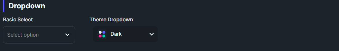
DaisySelect is a styled ComboBox with 9 variants and 4 size presets. It provides a chevron toggle, placeholder text, and themed dropdown. Use it for single-select dropdowns that need DaisyUI styling.
Variant Options
| Variant |
Description |
| Bordered (default) |
Subtle base-300 border; brightens on focus. |
| Ghost |
Borderless, transparent background; adds light fill on hover. |
| Primary / Secondary / Accent |
Colored borders. |
| Info / Success / Warning / Error |
Semantic border colors. |
Size Options
| Size |
Height |
Font Size |
| ExtraSmall |
24 |
10 |
| Small |
32 |
12 |
| Medium (default) |
48 |
14 |
| Large |
64 |
18 |
NOTE
DaisySelect uses
fixed heights for each size to match DaisyUI's design.
Quick Examples
<!-- Basic -->
<controls:DaisySelect PlaceholderText="Pick one">
    <ComboBoxItem>Han Solo</ComboBoxItem>
    <ComboBoxItem>Greedo</ComboBoxItem>
</controls:DaisySelect>

<!-- Ghost + primary -->
<controls:DaisySelect Variant="Ghost" PlaceholderText="Ghost">
    <ComboBoxItem>Option 1</ComboBoxItem>
</controls:DaisySelect>
<controls:DaisySelect Variant="Primary" PlaceholderText="Primary">
    <ComboBoxItem>Option 1</ComboBoxItem>
</controls:DaisySelect>

<!-- Compact -->
<controls:DaisySelect Size="Small" PlaceholderText="Small">
    <ComboBoxItem>A</ComboBoxItem>
    <ComboBoxItem>B</ComboBoxItem>
</controls:DaisySelect>
Tips & Best Practices
- Use Ghost on colored backgrounds; use Bordered/Primary for standard light layouts.
- Keep placeholder concise; it shows when no selection is made.
- Consider width constraints: the dropdown
Popup inherits the control width; set explicit widths for narrow layouts.
- For larger option sets, pair with search/filter UI outside the ComboBox for usability.