DaisyInput is a styled TextBox with 10 variants and 4 size presets. It supports bordered, ghost, filled, and semantic colored borders, plus labels, helper text, icons, and inner content slots. Defaults to a padded, rounded text field that matches DaisyUI forms.
| Variant | Description |
|---|---|
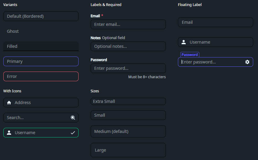
| Bordered (default) | Subtle 30% opacity border; brightens on focus. |
| Ghost | No border and transparent background; adds light fill on focus. |
| Filled | Filled background with bottom border; ideal for material-style forms. |
| Primary / Secondary / Accent | Colored borders with focus states. |
| Info / Success / Warning / Error | Semantic border colors. |
DaisyInput uses fixed heights for each size to match DaisyUI's design.
| Size | Height | Font Size | Floating Height | Use Case |
|---|---|---|---|---|
| ExtraSmall | 24 | 10 | 40 | Dense tables/toolbars. |
| Small | 32 | 12 | 48 | Compact forms. |
| Medium (default) | 48 | 14 | 56 | General usage. |
| Large | 64 | 18 | 64 | Prominent inputs/hero sections. |
LabelPosition="Floating" are slightly larger to provide vertical headroom for the label. See DaisyInputFloating*Height tokens in Design Tokens documentation.DaisyTextArea instead.DaisyInput extends TextBox - all standard TextBox properties (Text, Watermark, Padding, TextAlignment, TextWrapping, VerticalContentAlignment, etc.) are supported.
| Property | Type | Default | Description |
|---|---|---|---|
Variant |
DaisyInputVariant |
Bordered |
Visual style variant (see table above). |
Size |
DaisySize |
Medium |
Size preset (see table above). |
Label |
string? |
null |
Label text displayed above the input. |
LabelPosition |
DaisyLabelPosition |
Top |
Label positioning mode (None, Top, Floating, Inset). Floating mode features a high-fidelity "identity clone" animation. |
IsRequired |
bool |
false |
Shows asterisk (*) indicator next to label. |
IsOptional |
bool |
false |
Shows "Optional field" text next to label. |
HintText |
string? |
null |
Hint text displayed below label, above input. |
HelperText |
string? |
null |
Helper text displayed below input (right-aligned). |
StartIcon |
StreamGeometry? |
null |
Icon displayed at the start (left) of the input. |
EndIcon |
StreamGeometry? |
null |
Icon displayed at the end (right) of the input. |
BorderRingBrush |
IBrush? |
null |
Custom brush for the focus ring (overrides default). |
InnerLeftContent |
object |
null |
Content slot inside left edge (e.g., search icon). |
InnerRightContent |
object |
null |
Content slot inside right edge (e.g., clear button). |
The VerticalContentAlignment property controls vertical positioning of both the watermark and text content:
DaisyTextArea for multi-line editing.Setting LabelPosition="Floating" enables a high-fidelity interaction inspired by SmoothUI and Material Design.
1. Identity Match: The label starts exactly overlayed on the watermark, matching its font size, position, and opacity.
2. Instant Switch: Upon focus, the label instantly snaps to its active style (primary color and semi-bold weight) but stays stationary.
3. Delayed Float: After a 50ms pause, the label smoothly scales down and slides to the top border using a Material-standard cubic-bezier easing.
4. Persistence: The label remains in the floated position as long as the input has focus or contains text (tracked via the :hastext pseudo-class).
Floating labels require additional vertical headroom above the input border to prevent clipping. This is handled automatically by the control's template using dedicated design tokens:
DaisyInputFloatingMediumHeight (Default: 56px)DaisyInputFloatingSmallHeight (Default: 48px)DaisyInputFloatingExtraSmallHeight (Default: 40px)DaisyInputFloatingLargeHeight (Default: 64px)<!-- Basic -->
<controls:DaisyInput Watermark="Bordered (Default)" />
<!-- Filled variant -->
<controls:DaisyInput Variant="Filled" Watermark="Filled style" />
<!-- With label and required indicator -->
<controls:DaisyInput Label="Email" IsRequired="True" Watermark="Enter email..." />
<!-- With label and optional indicator -->
<controls:DaisyInput Label="Notes" IsOptional="True" HelperText="Optional field" Watermark="Enter notes..." />
<!-- With helper text -->
<controls:DaisyInput Label="Password" HelperText="Must be at least 8 characters" Watermark="Enter password..." />
<!-- Floating Label -->
<controls:DaisyInput Label="Email Address" LabelPosition="Floating" Watermark="Enter email..." />
<!-- With icons -->
<controls:DaisyInput StartIcon="{StaticResource DaisyIconHome}" Watermark="Address" />
<controls:DaisyInput EndIcon="{StaticResource DaisyIconSearch}" Watermark="Search..." />
<!-- Semantic variants -->
<controls:DaisyInput Variant="Error" HelperText="Invalid input" Watermark="Error state" />
<controls:DaisyInput Variant="Success" HelperText="Looks good!" Watermark="Valid input" />
<!-- Sizes -->
<controls:DaisyInput Size="Small" Watermark="Small Input" />
<controls:DaisyInput Size="Large" Watermark="Large Input" />Label for form field names and Watermark for placeholder text inside the input.IsRequired="True" to show an asterisk (*) indicator for required fields.HelperText for validation messages or additional guidance.Padding consistent across form fields; sizes already tune height and font size.InnerRightContent.