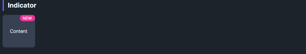
DaisyIndicator overlays a badge on top of any content (often an icon or card). You provide the main Content and a Badge slot; the badge is positioned via alignment properties and offset with a half-size translate to sit on the corner. Use it for notification dots, counts, or status chips.
| Property | Description |
|---|---|
Badge |
Badge content (e.g., DaisyBadge, ellipse, dot). Hidden when null. |
BadgeHorizontalAlignment |
Left, Center, Right (default Right). |
BadgeVerticalAlignment |
Top, Center, Bottom (default Top). |
<!-- Icon with count -->
<controls:DaisyIndicator>
    <controls:DaisyIndicator.Badge>
        <controls:DaisyBadge Variant="Primary" Content="99+" />
    </controls:DaisyIndicator.Badge>
    <Button Content="Inbox" />
</controls:DaisyIndicator>

<!-- Top-left dot on an avatar -->
<controls:DaisyIndicator BadgeHorizontalAlignment="Left"
                         BadgeVerticalAlignment="Top">
    <controls:DaisyIndicator.Badge>
        <Border Width="10" Height="10" CornerRadius="5" Background="Red" />
    </controls:DaisyIndicator.Badge>
    <controls:DaisyAvatar Size="Large" Status="Online" />
</controls:DaisyIndicator>DaisyBadge with Size="ExtraSmall" works well for counts.Border or Ellipse is lighter than a full badge control.