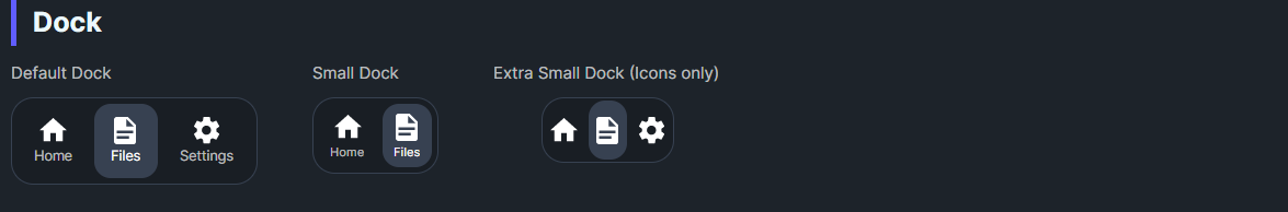
DaisyDock arranges action buttons in a pill-shaped bar, similar to a bottom navigation dock. It supports 5 sizes, optional auto-selection that applies the dock-active class, and raises an ItemSelected event when a button is clicked. Commonly used for app bars or compact nav strips.
| Member | Description |
|---|---|
Size (ExtraSmall, Small, Medium, Large, ExtraLarge) |
Adjusts bar height, button padding, and label size/visibility. ExtraSmall hides labels for icon-only docks. |
AutoSelect (bool, default True) |
When true, clicking a button adds dock-active to it and removes from siblings. |
ItemSelected event |
Raised with DockItemSelectedEventArgs containing the clicked Control (usually a Button). |
<!-- Default dock -->
<controls:DaisyDock ItemSelected="OnDockItemSelected">
    <Button Tag="Home" Classes="dock-active">
        <StackPanel>
            <PathIcon Data="{StaticResource DaisyIconHome}" />
            <TextBlock Classes="dock-label" Text="Home" />
        </StackPanel>
    </Button>
    <Button Tag="Files">
        <StackPanel>
            <PathIcon Data="{StaticResource DaisyIconDocument}" />
            <TextBlock Classes="dock-label" Text="Files" />
        </StackPanel>
    </Button>
    <Button Tag="Settings">
        <StackPanel>
            <PathIcon Data="{StaticResource DaisyIconSettings}" />
            <TextBlock Classes="dock-label" Text="Settings" />
        </StackPanel>
    </Button>
</controls:DaisyDock>

<!-- Small and extra-small (icons only) -->
<controls:DaisyDock Size="Small">
    <Button><PathIcon Data="{StaticResource DaisyIconHome}" /></Button>
    <Button Classes="dock-active"><PathIcon Data="{StaticResource DaisyIconDocument}" /></Button>
</controls:DaisyDock>

<controls:DaisyDock Size="ExtraSmall">
    <Button><PathIcon Data="{StaticResource DaisyIconHome}" /></Button>
    <Button Classes="dock-active"><PathIcon Data="{StaticResource DaisyIconSettings}" /></Button>
</controls:DaisyDock>Tag or command bindings to route clicks; handle ItemSelected to update navigation state.AutoSelect="False" and manage the dock-active class yourself.