DaisyDivider
Overview
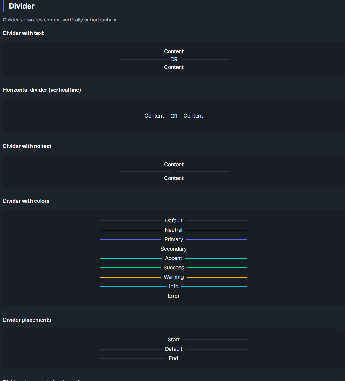
DaisyDivider separates content with a line that can run horizontally (default) or vertically (Horizontal=True). It supports 9 color options, start/end placement to hide one side of the line, optional inline content, and adjustable margins.
Orientation & Placement
| Option |
Description |
Horizontal=False (default) |
Renders a horizontal rule (line left/right). |
Horizontal=True |
Renders a vertical rule (line above/below). |
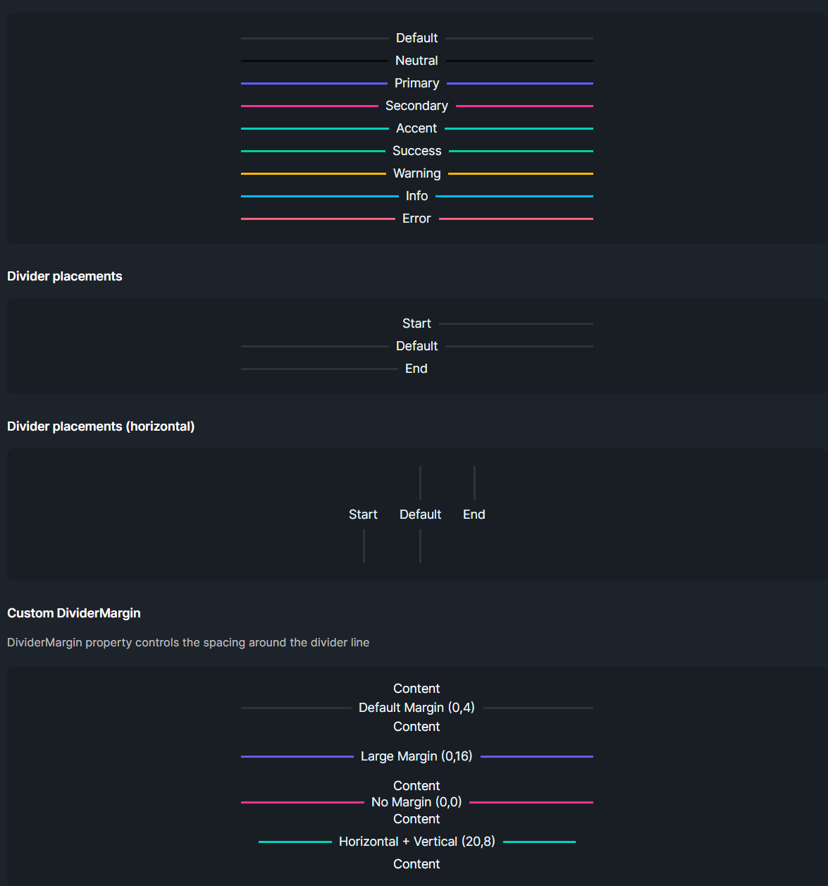
Placement=Start |
Hides the line before the content (useful for headings). |
Placement=End |
Hides the line after the content. |
Color Options
| Color |
Description |
| Default |
Subtle base-content line (10% opacity). |
| Neutral / Primary / Secondary / Accent / Success / Warning / Info / Error |
Solid colored line matching the Daisy palette. |
Layout
| Property |
Description |
DividerMargin |
Spacing around the line/content (default 0,4). |
Content |
Inline text/element placed between (or beside in vertical mode) the line segments. Hidden automatically when empty. |
Quick Examples
<!-- Basic divider with text -->
<controls:DaisyDivider>OR</controls:DaisyDivider>

<!-- Vertical divider between items -->
<StackPanel Orientation="Horizontal" HorizontalAlignment="Center" Spacing="16">
    <TextBlock Text="Left" VerticalAlignment="Center" />
    <controls:DaisyDivider Horizontal="True" Height="60">OR</controls:DaisyDivider>
    <TextBlock Text="Right" VerticalAlignment="Center" />
</StackPanel>

<!-- Colored dividers -->
<controls:DaisyDivider Color="Primary">Primary</controls:DaisyDivider>
<controls:DaisyDivider Color="Success">Success</controls:DaisyDivider>
<controls:DaisyDivider Color="Error">Error</controls:DaisyDivider>

<!-- Placements -->
<controls:DaisyDivider Placement="Start">Start</controls:DaisyDivider>
<controls:DaisyDivider>Default</controls:DaisyDivider>
<controls:DaisyDivider Placement="End">End</controls:DaisyDivider>

<!-- Custom margin -->
<controls:DaisyDivider DividerMargin="0,16" Color="Accent">More breathing room</controls:DaisyDivider>
Tips & Best Practices
- Use
Horizontal=True for separating items in toolbars or inline menus.
- Apply
Placement=Start to align section titles with a trailing rule without a leading line.
- Increase
DividerMargin when separating large blocks; reduce it for dense lists.
- If the divider appears too faint on dark backgrounds, pick a color variant instead of the default.