DaisyColorPickerDialog is a comprehensive color picker dialog that combines all color picker components into a single, professional interface.
| Property | Type | Default | Description |
|---|---|---|---|
Color |
Color |
Red |
The selected color |
OriginalColor |
Color |
Red |
The original color (for comparison) |
CustomColors |
ColorCollection? |
null |
Custom colors collection |
ShowAlphaChannel |
bool |
true |
Show alpha channel controls |
ShowColorWheel |
bool |
true |
Show the color wheel |
ShowColorGrid |
bool |
true |
Show the color palette grid |
ShowColorEditor |
bool |
true |
Show the RGB/HSL editor |
ShowScreenColorPicker |
bool |
true |
Show the eyedropper tool |
PreserveAlphaChannel |
bool |
false |
Preserve alpha when selecting colors |
| Event | Description |
|---|---|
PreviewColorChanged |
Fired when the preview color changes (before OK is clicked) |
The dialog is a composite control that assembles several standalone color picker controls into a unified interface. Each component is a separate, reusable control with its own C# class and AXAML theme:
| File | Purpose |
|---|---|
DaisyColorPickerDialog.cs |
Dialog window, layout, and coordination logic |
DaisyColorWheel.cs + .axaml |
Standalone color wheel control |
DaisyColorGrid.cs + .axaml |
Standalone color palette grid |
DaisyColorEditor.cs + .axaml |
Standalone RGB/HSL editor with sliders |
DaisyColorSlider.cs + .axaml |
Standalone color channel slider |
DaisyScreenColorPicker.cs + .axaml |
Standalone eyedropper tool |
The dialog builds its UI programmatically in C# (not AXAML) by creating instances of these controls and arranging them in a layout. This means:
DaisyColorPickerDialog.cs.axaml themeEach component can also be used independently outside the dialog.
The dialog integrates these components:
| Component | Purpose |
|---|---|
DaisyColorWheel |
Visual hue/saturation selection |
DaisyColorSlider |
Lightness adjustment |
DaisyColorGrid |
Palette-based color selection |
DaisyColorEditor |
Precise RGB/HSL/Hex editing |
DaisyScreenColorPicker |
Pick colors from screen |
| Color Preview | Shows selected vs. original color |
<!-- Basic usage in code-behind -->// Show dialog and get result
var dialog = new DaisyColorPickerDialog
{
Color = currentColor,
OriginalColor = currentColor,
ShowAlphaChannel = true
};
var result = await dialog.ShowDialog<bool?>(parentWindow);
if (result == true)
{
// User clicked OK
ApplyColor(dialog.Color);
}// With custom colors
var dialog = new DaisyColorPickerDialog
{
Color = Colors.Blue,
OriginalColor = Colors.Blue,
CustomColors = new ColorCollection(new[]
{
Colors.Red,
Colors.Green,
Colors.Blue
})
};// Minimal dialog (wheel + editor only)
var dialog = new DaisyColorPickerDialog
{
Color = currentColor,
ShowColorGrid = false,
ShowScreenColorPicker = false
};// No alpha channel
var dialog = new DaisyColorPickerDialog
{
Color = currentColor,
ShowAlphaChannel = false,
PreserveAlphaChannel = false
};// Preview changes in real-time
var dialog = new DaisyColorPickerDialog
{
Color = currentColor
};
dialog.PreviewColorChanged += (s, e) =>
{
// Update preview in parent window
PreviewBorder.Background = new SolidColorBrush(e.Color);
};
await dialog.ShowDialog<bool?>(this);| Part Name | Type | Purpose |
|---|---|---|
PART_ColorWheel |
DaisyColorWheel |
Hue/saturation wheel |
PART_ColorGrid |
DaisyColorGrid |
Color palette |
PART_ColorEditor |
DaisyColorEditor |
RGB/HSL editor |
PART_ScreenColorPicker |
DaisyScreenColorPicker |
Eyedropper |
PART_LightnessSlider |
DaisyColorSlider |
Lightness control |
PART_ColorPreview |
Border |
Current color preview |
PART_OriginalColorPreview |
Border |
Original color preview |
PART_OkButton |
Button |
OK button |
PART_CancelButton |
Button |
Cancel button |
/// <summary>
/// Shows the color picker dialog and returns the selected color.
/// </summary>
/// <param name="owner">Parent window</param>
/// <param name="initialColor">Starting color</param>
/// <returns>Selected color, or null if cancelled</returns>
public static async Task<Color?> ShowDialogAsync(Window owner, Color initialColor)
{
    var dialog = new DaisyColorPickerDialog
    {
        Color = initialColor,
        OriginalColor = initialColor
    };

    var result = await dialog.ShowDialog<bool?>(owner);
    return result == true ? dialog.Color : (Color?)null;
}

// Usage:
var color = await DaisyColorPickerDialog.ShowDialogAsync(this, Colors.Red);
if (color.HasValue)
{
    ApplyColor(color.Value);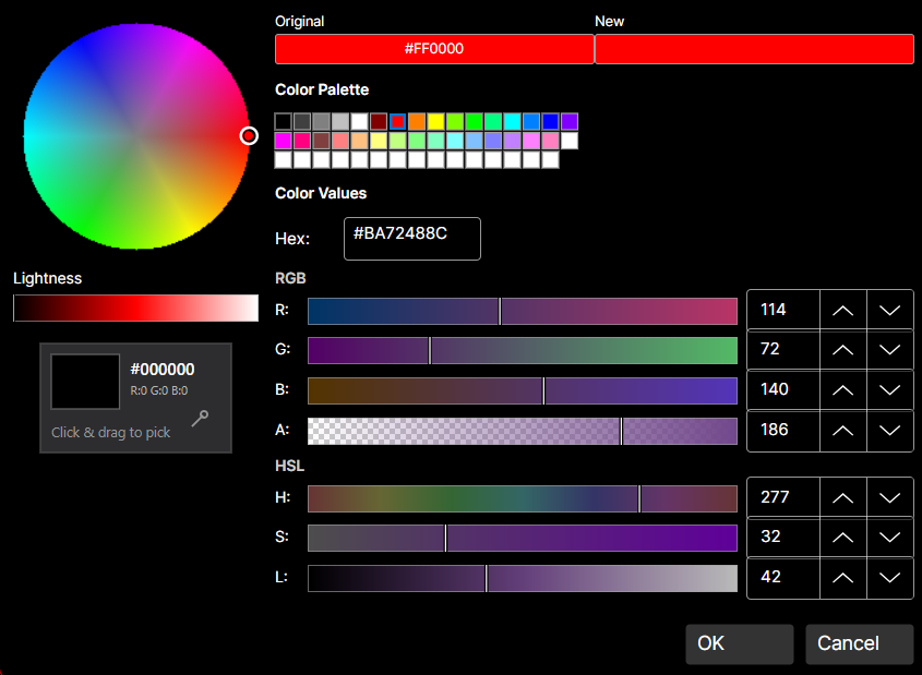
}┌─────────────────────────────────────────────────────────┐
│ ┌──────────────┐ ┌─────────────────────────────────┐ │
│ │ │ │ Color Grid (Palette) │ │
│ │ Color │ │ ████████████████████████████ │ │
│ │ Wheel │ │ ████████████████████████████ │ │
│ │ │ │ │ │
│ │ ● │ ├─────────────────────────────────┤ │
│ │ │ │ RGB Sliders │ │
│ └──────────────┘ │ R: ═══════════○═══════ [255] │ │
│ ┌──┐ │ G: ═══○═══════════════ [128] │ │
│ │L │ │ B: ○═════════════════ [0] │ │
│ │i │ ├─────────────────────────────────┤ │
│ │g │ │ HSL Sliders │ │
│ │h │ │ H: ═══════════○═══════ [180] │ │
│ │t │ │ S: ═══════════════○═══ [100] │ │
│ │ │ │ L: ═══════○═══════════ [50] │ │
│ └──┘ ├─────────────────────────────────┤ │
│ │ Hex: #FF8000 │ │
│ ┌────┬────┐ └─────────────────────────────────┘ │
│ │New │Orig│ [👁 Eyedropper] │
│ └────┴────┘ │
│ [ OK ] [ Cancel ] │
└─────────────────────────────────────────────────────────┘OriginalColor to show a comparison between old and new colors.PreviewColorChanged event for real-time preview updates in the parent UI.PreserveAlphaChannel when editing colors that should keep their transparency.ShowColorGrid="False") for a simpler interface.true when OK is clicked, false or null when cancelled.ColorCollection.This dialog and its component controls are inspired by the Cyotek ColorPicker library (MIT License).