DaisyCollapse
Overview
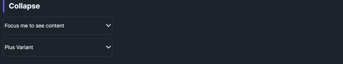
DaisyCollapse is an Expander-based container for revealing content under a clickable header. It offers Arrow and Plus indicator variants with a 0.2s rotation animation, uses configurable padding/corners from the theme, and hides content when collapsed. Ideal for short disclosures, FAQs, or inline details.
Variant Options
| Variant |
Description |
| Arrow (default) |
Chevron on the right rotates 180° when expanded. |
| Plus |
Plus icon rotates into an “×” when expanded. |
Behavior
| Property |
Description |
IsExpanded |
Toggles visibility of the content presenter; bound to the header toggle. |
Header |
Shown in the toggle button; can be any content. |
Content |
Shown below the header when expanded; supports any child UI. |
Padding / CornerRadius |
Control spacing and rounding of both header and body regions. |
Quick Examples
<!-- Default arrow collapse -->
<controls:DaisyCollapse Header="Focus me to see content">
    <TextBlock Text="Here is the hidden content." Padding="10" />
</controls:DaisyCollapse>

<!-- Plus variant -->
<controls:DaisyCollapse Variant="Plus" Header="Plus Variant">
    <TextBlock Text="More content." Padding="10" />
</controls:DaisyCollapse>

<!-- Nested content with inputs -->
<controls:DaisyCollapse Header="Filters">
    <StackPanel Spacing="8">
        <controls:DaisyCheckBox Content="In stock" IsChecked="True" />
        <controls:DaisyCheckBox Content="On sale" />
        <controls:DaisyButton Content="Apply" Variant="Primary" Size="Small" />
    </StackPanel>
</controls:DaisyCollapse>
Tips & Best Practices
- Use Plus when you want a bold open/close affordance; use Arrow for subtle disclosures.
- Keep headers concise; long text wraps but can push icons aside - use tooltips for extra context.
- If you need multiple collapsibles with mutual exclusivity, use
DaisyAccordion instead.
- Add
Padding to the body content for spacing; default padding is applied from the theme.