DaisyCheckBox
Overview
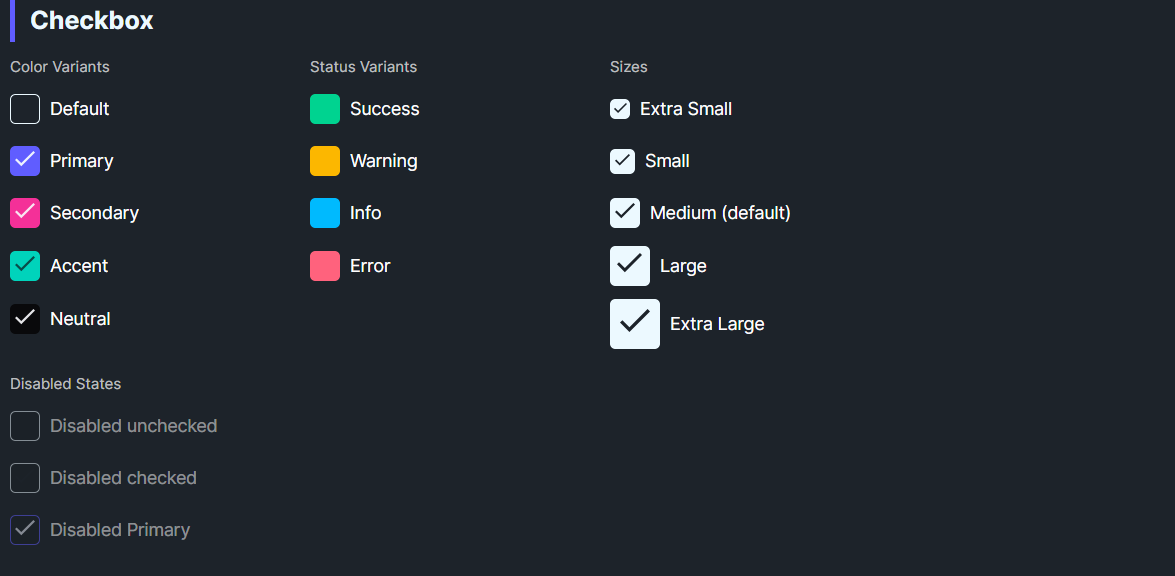
DaisyCheckBox is a styled checkbox with 9 color variants and 5 size presets. It uses a filled box with a checkmark when checked and inherits Avalonia's standard IsChecked/IsThreeState behavior. Use variants for semantic meaning and sizes to match surrounding controls.
Variant Options
| Variant |
Description |
| Default |
Neutral base styling. |
| Primary / Secondary / Accent |
Brand-aligned colors for emphasis. |
| Neutral |
Muted neutral fill. |
| Info / Success / Warning / Error |
Semantic colors for statuses. |
Size Options
| Size |
Box (approx) |
Check |
Use Case |
| ExtraSmall |
16px |
10px |
Dense tables/toolbars. |
| Small |
20px |
12px |
Compact forms. |
| Medium (default) |
24px |
16px |
General usage. |
| Large |
32px |
20px |
Spacious layouts, cards. |
| ExtraLarge |
40px |
24px |
Hero sections or touch targets. |
Quick Examples
<!-- Basic variants -->
<controls:DaisyCheckBox Content="Default" />
<controls:DaisyCheckBox Content="Primary" Variant="Primary" IsChecked="True" />
<controls:DaisyCheckBox Content="Warning" Variant="Warning" IsChecked="True" />
<controls:DaisyCheckBox Content="Error" Variant="Error" IsChecked="True" />

<!-- Sizes -->
<StackPanel Spacing="6">
    <controls:DaisyCheckBox Content="Extra Small" Size="ExtraSmall" IsChecked="True" />
    <controls:DaisyCheckBox Content="Small" Size="Small" IsChecked="True" />
    <controls:DaisyCheckBox Content="Medium" Size="Medium" IsChecked="True" />
    <controls:DaisyCheckBox Content="Large" Size="Large" IsChecked="True" />
    <controls:DaisyCheckBox Content="Extra Large" Size="ExtraLarge" IsChecked="True" />
</StackPanel>

<!-- Disabled states -->
<controls:DaisyCheckBox Content="Disabled unchecked" IsEnabled="False" />
<controls:DaisyCheckBox Content="Disabled checked" IsEnabled="False" IsChecked="True" />
<controls:DaisyCheckBox Content="Disabled Primary" Variant="Primary" IsEnabled="False" IsChecked="True" />
Tips & Best Practices
- Pair sizes with neighboring controls (Small for dense forms; Large for card layouts or touch devices).
- Use semantic variants to reinforce status (Success/Warning/Error) without extra icons.
- Keep content concise; longer labels may need additional left padding if you override
Padding.
- Respect accessibility: ensure checked/unchecked colors have sufficient contrast against backgrounds.