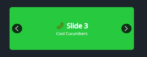
DaisyCarousel is a slide container with built-in previous/next buttons and directional slide transitions. It uses TransitioningContentControl under the hood to animate between items and flips the animation direction based on which arrow you press. Perfect for small galleries or showcasing featured items without autoplay.
| Feature | Description |
|---|---|
| Arrow buttons | Template parts PART_PreviousButton and PART_NextButton drive navigation. |
| Direction-aware animation | Slides enter/exit left or right depending on the last arrow clicked. |
| Transition timing | 300ms cubic easing for both in/out motions. |
| Content binding | Displays SelectedItem with ItemTemplate (inherits from Carousel). |
<!-- Basic carousel with colored slides -->
<controls:DaisyCarousel Width="450" Height="150">
    <Border Background="#FF5F56" CornerRadius="8" />
    <Border Background="#FFBD2E" CornerRadius="8" />
    <Border Background="#27C93F" CornerRadius="8" />
    <Border Background="#007BFF" CornerRadius="8" />
</controls:DaisyCarousel>

<!-- Carousel with templated items -->
<controls:DaisyCarousel ItemsSource="{Binding FeaturedCards}"
                        Width="480"
                        Height="200">
    <controls:DaisyCarousel.ItemTemplate>
        <DataTemplate>
            <controls:DaisyCard Variant="Compact" BodyPadding="16">
                <StackPanel Spacing="6">
                    <TextBlock Text="{Binding Title}" FontWeight="SemiBold" />
                    <TextBlock Text="{Binding Subtitle}" Opacity="0.8" />
                    <controls:DaisyButton Content="View" Variant="Primary" Size="Small" />
                </StackPanel>
            </controls:DaisyCard>
        </DataTemplate>
    </controls:DaisyCarousel.ItemTemplate>
</controls:DaisyCarousel>Width/Height so content clips cleanly within the rounded host.ItemsSource + ItemTemplate instead of manually adding children.Next()/Previous() on intervals.