DaisyCard
Overview
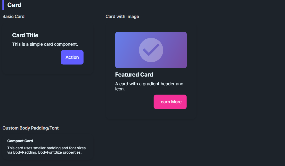
DaisyCard provides a panel for grouping content with padding, rounded corners, and optional glass effects. It supports 3 layout variants (Normal, Compact, Side), configurable body/title typography, and an opt-in glassmorphism stack with tint/blur controls. Use it for dashboards, feature tiles, or content groupings; compose headers, bodies, and action rows inside.
Variant Options
| Variant |
Description |
| Normal (default) |
Standard padding (32) and 16px corner radius. |
| Compact |
Reduced padding (16) for dense layouts or nested cards. |
| Side |
Reserved for side-by-side card styling; currently matches Normal styling. |
Glass Effect Settings
| Property |
Description |
IsGlass |
Switches to the layered glass template (tinted + gradients + inner shine). Disables the drop shadow. |
GlassBlur |
Blur intensity for the frosted look (default 40). |
GlassOpacity |
Opacity of the base tint layer (default 0.3). |
GlassTint / GlassTintOpacity |
Tint color and its opacity (defaults: White, 0.5). |
GlassBorderOpacity |
Alpha for the outer border (default 0.2). |
Typography & Layout
| Property |
Description |
BodyPadding |
Controls padding around content (default 32; compact sets 16). |
BodyFontSize |
Body text size (default 14). |
TitleFontSize |
Title text size (default 20). |
Content Structure
Place any layout/content inside the card; common patterns:
- Title + body text
- Media (images/charts) with CTA buttons
- Form sections
<!-- Standard card -->
<controls:DaisyCard>
    <StackPanel Spacing="10">
        <TextBlock Text="Card Title" FontWeight="SemiBold" FontSize="18" />
        <TextBlock Text="Supporting description goes here." TextWrapping="Wrap" />
        <StackPanel Orientation="Horizontal" Spacing="8">
            <controls:DaisyButton Content="Action" Variant="Primary" />
            <controls:DaisyButton Content="Secondary" Variant="Ghost" />
        </StackPanel>
    </StackPanel>
</controls:DaisyCard>

<!-- Compact card -->
<controls:DaisyCard Variant="Compact">
    <StackPanel Spacing="6">
        <TextBlock Text="Compact Card" FontWeight="Bold" />
        <TextBlock Text="Tighter padding for dense layouts." />
    </StackPanel>
</controls:DaisyCard>

<!-- Glass card -->
<controls:DaisyCard IsGlass="True" Width="260">
    <StackPanel Spacing="8">
        <TextBlock Text="Glass Card" FontWeight="Bold" FontSize="18" />
        <TextBlock Text="Subtle tint with frosted layers." TextWrapping="Wrap" />
    </StackPanel>
</controls:DaisyCard>

<!-- Glass with custom tint -->
<controls:DaisyCard IsGlass="True" GlassTint="#000000" GlassOpacity="0.4" GlassTintOpacity="0.6" Width="260">
    <StackPanel Spacing="8">
        <TextBlock Text="Dark Glass" FontWeight="Bold" />
        <TextBlock Text="Higher tint opacity for contrast." TextWrapping="Wrap" />
    </StackPanel>
</controls:DaisyCard>
Tips & Best Practices
- Use Compact when cards are nested in grids or lists to conserve space.
- Glass mode removes the default shadow - place on contrasting backgrounds to maintain depth.
- Adjust
BodyPadding for edge-to-edge media (e.g., set to 0 and pad inner content manually).
- Set explicit
Width or use layout constraints for uniform card grids.
- Pair with DaisyButton variants for clear primary/secondary actions inside the card.