DaisySteps
Overview
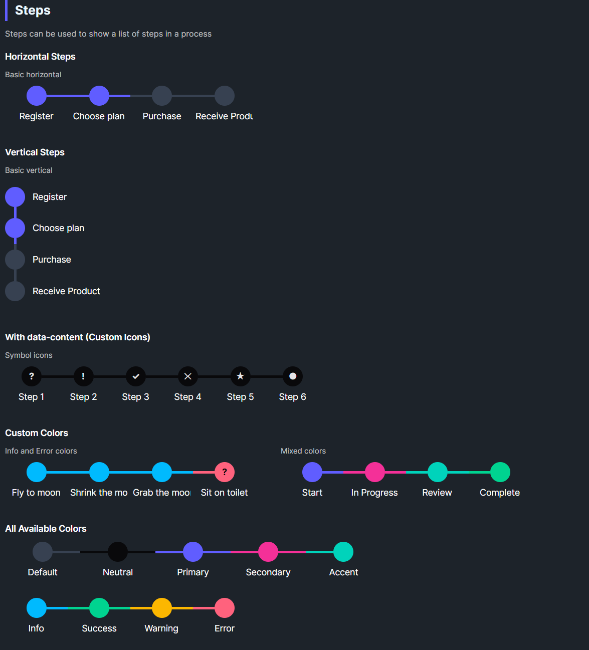
DaisySteps renders a sequence of step items with lines and circles. It supports horizontal or vertical layouts, 5 sizes, colored states per step, and an SelectedIndex to mark completed/active steps. Each DaisyStepItem can show custom text or icons via Content/DataContent.
DaisySteps Properties
| Property |
Description |
Orientation |
Horizontal (default) or Vertical. |
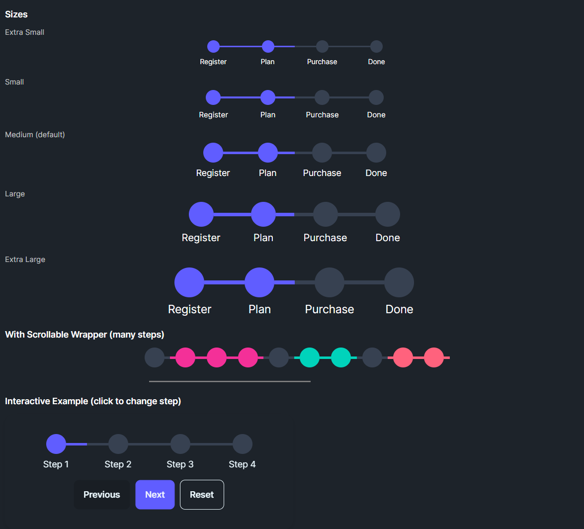
Size |
ExtraSmall, Small, Medium (default), Large, ExtraLarge (affects circle/line sizes and fonts). |
SelectedIndex |
0-based index; steps with index ≤ SelectedIndex become active. |
JsonSteps |
A JSON string describing step objects: [{"content": "Label", "color": "Primary", "isActive": true}, ...]. |
DaisyStepItem Properties
| Property |
Description |
Content |
Step label shown under/right of the circle. |
DataContent |
Optional text inside the circle (number/icon). |
Icon |
Slot available if you template-in; not used in default theme. |
Color |
Step color: Default, Neutral, Primary, Secondary, Accent, Info, Success, Warning, Error. |
IsActive |
Set by DaisySteps when SelectedIndex includes the step. |
Quick Examples
<!-- Horizontal steps -->
<controls:DaisySteps SelectedIndex="1" Width="400">
    <controls:DaisyStepItem Content="Register" Color="Primary" />
    <controls:DaisyStepItem Content="Choose plan" Color="Primary" />
    <controls:DaisyStepItem Content="Purchase" />
    <controls:DaisyStepItem Content="Receive" />
</controls:DaisySteps>

<!-- Vertical steps -->
<controls:DaisySteps Orientation="Vertical" SelectedIndex="1" Height="200">
    <controls:DaisyStepItem Content="Register" Color="Primary" />
    <controls:DaisyStepItem Content="Plan" Color="Primary" />
    <controls:DaisyStepItem Content="Purchase" />
</controls:DaisySteps>

<!-- Custom data content -->
<controls:DaisySteps Width="300">
    <controls:DaisyStepItem Content="Step 1" DataContent="?" Color="Neutral" />
    <controls:DaisyStepItem Content="Step 2" DataContent="!" Color="Neutral" />
    <controls:DaisyStepItem Content="Step 3" DataContent="✓" Color="Success" />
</controls:DaisySteps>

<!-- Dynamic JSON Loading -->
<controls:DaisySteps JsonSteps='[
    {"content": "Initialize", "color": "Neutral", "isActive": true},
    {"content": "Upload Data", "color": "Primary", "isActive": true},
    {"content": "Processing", "color": "Warning", "isActive": false},
    {"content": "Finish", "color": "Success", "isActive": false}
]' />
// C#: JSON string
var steps = new DaisySteps
{
    Width = 400,
    JsonSteps = "[{\"content\":\"Register\",\"color\":\"Primary\",\"isActive\":true}," +
                "{\"content\":\"Choose plan\",\"color\":\"Primary\"}," +
                "{\"content\":\"Purchase\"}," +
                "{\"content\":\"Receive\"}]"
};
Tips & Best Practices
- Set
SelectedIndex as progress advances; earlier steps automatically become active.
- Choose size based on layout density; ExtraSmall/Small for sidebars, Large/XL for wizards.
- Use
Color to convey status (e.g., Error for failed steps, Success for completed).
- For vertical layouts, ensure enough height to accommodate circles, lines, and labels.
- Replace circle content (via
DataContent or a templated icon) to show numbers or checkmarks.