DaisySelect
Overview
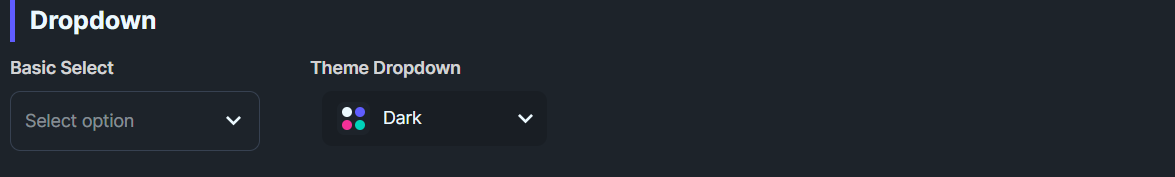
DaisySelect is a styled ComboBox with 9 variants and 4 size presets. It provides a chevron toggle, placeholder text, and themed dropdown. Use it for single-select dropdowns that need DaisyUI styling.
Variant Options
| Variant |
Description |
| Bordered (default) |
Subtle base-300 border; brightens on focus. |
| Ghost |
Borderless, transparent background; adds light fill on hover. |
| Primary / Secondary / Accent |
Colored borders. |
| Info / Success / Warning / Error |
Semantic border colors. |
Size Options
| Size |
Height |
Font Size |
| ExtraSmall |
24 |
10 |
| Small |
32 |
12 |
| Medium (default) |
48 |
14 |
| Large |
64 |
18 |
NOTE
DaisySelect uses
fixed heights for each size to match DaisyUI's design.
Quick Examples
<!-- Basic -->
<controls:DaisySelect PlaceholderText="Pick one">
    <ComboBoxItem>Han Solo</ComboBoxItem>
    <ComboBoxItem>Greedo</ComboBoxItem>
</controls:DaisySelect>

<!-- Ghost + primary -->
<controls:DaisySelect Variant="Ghost" PlaceholderText="Ghost">
    <ComboBoxItem>Option 1</ComboBoxItem>
</controls:DaisySelect>
<controls:DaisySelect Variant="Primary" PlaceholderText="Primary">
    <ComboBoxItem>Option 1</ComboBoxItem>
</controls:DaisySelect>

<!-- Compact -->
<controls:DaisySelect Size="Small" PlaceholderText="Small">
    <ComboBoxItem>A</ComboBoxItem>
    <ComboBoxItem>B</ComboBoxItem>
</controls:DaisySelect>
Tips & Best Practices
- Use Ghost on colored backgrounds; use Bordered/Primary for standard light layouts.
- Keep placeholder concise; it shows when no selection is made.
- Consider width constraints: the dropdown
Popup inherits the control width; set explicit widths for narrow layouts.
- For larger option sets, pair with search/filter UI outside the ComboBox for usability.
Localization Refresh (DaisySelectItem)
DaisySelectItem is a DependencyObject and does not live in the visual tree, so bindings that rely on a parent DataContext can fail to refresh when the page resets DataContext (e.g., during runtime language changes). This can result in empty dropdown rows even though the items are still present.
Recommended pattern: set a localization source on the select and provide localization keys on each item. DaisySelect will resolve and refresh item text whenever the localization source raises PropertyChanged (or when you call RefreshLocalization()).
<controls:DaisySelect LocalizationSource="{x:Bind Localization, Mode=OneWay}">
    <controls:DaisySelectItem LocalizationKey="Gallery_Carousel_Mode_Manual" Tag="Manual" />
    <controls:DaisySelectItem LocalizationKey="Gallery_Carousel_Mode_Slideshow" Tag="Slideshow" />
</controls:DaisySelect>
Notes:
LocalizationSource can be an indexer-based object (e.g., Localization["Key"]), a Func, or a dictionary (IDictionary).- If your localization system does not raise
PropertyChanged, call RefreshLocalization() after switching cultures.
- This works with the default
DaisySelect template; no custom ItemContainerStyle is required because the text is updated on the DaisySelectItem itself.