DaisyFab
Overview
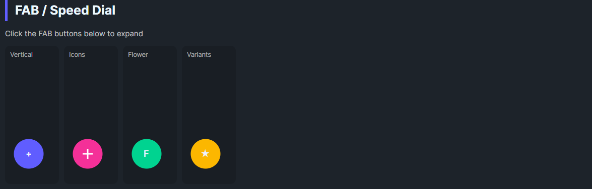
DaisyFab is a Floating Action Button container with a trigger button and expandable action buttons. It supports Vertical, Horizontal, or Flower layouts, auto-closes when an action is clicked, and lets you customize trigger content, size, and variant. Ideal for exposing a small set of secondary actions from a single FAB.
Layout & Interaction
| Property |
Description |
Layout |
Vertical (default) stacks actions above trigger; Horizontal places actions to the left of trigger; Flower uses larger spacing. |
IsOpen |
Toggles visibility of action buttons. Trigger click flips this. |
AutoClose (default True) |
Clicking an action button closes the menu automatically. |
Trigger Appearance
| Property |
Description |
TriggerVariant |
DaisyButton variant for the trigger (default Primary). |
TriggerContent |
Text or simple content for the trigger (default "+"). |
TriggerIconData |
Path data string for the trigger icon (recommended for icons). |
TriggerIconSize |
Size of the trigger icon in pixels (default 16). |
Sizing
| Property |
Description |
Size |
Controls the size of both the trigger and all action buttons (ExtraSmall through ExtraLarge). |
The FAB automatically propagates its Size to all child action buttons. You don't need to set Size on individual action buttons—they inherit from the parent FAB.
Global Size Support: DaisyFab responds to FlowerySizeManager.CurrentSize changes. When the global size changes, the FAB and all its action buttons update automatically (unless FlowerySizeManager.IgnoreGlobalSize is set).
Quick Examples
<!-- Vertical FAB (default) - actions appear above trigger -->
<daisy:DaisyFab TriggerContent="+" TriggerVariant="Primary" Size="Medium">
    <StackPanel>
        <daisy:DaisyButton Shape="Circle" Content="A" />
        <daisy:DaisyButton Shape="Circle" Content="B" />
        <daisy:DaisyButton Shape="Circle" Content="C" />
    </StackPanel>
</daisy:DaisyFab>

<!-- Horizontal FAB - actions appear to the left of trigger -->
<daisy:DaisyFab Layout="Horizontal" TriggerContent="+" TriggerVariant="Accent" Size="Medium"
    HorizontalAlignment="Left" VerticalAlignment="Bottom">
    <StackPanel>
        <daisy:DaisyButton Shape="Circle" Content="1" />
        <daisy:DaisyButton Shape="Circle" Content="2" />
        <daisy:DaisyButton Shape="Circle" Content="3" />
    </StackPanel>
</daisy:DaisyFab>

<!-- FAB with icon buttons (recommended pattern) -->
<daisy:DaisyFab TriggerVariant="Secondary" Size="Medium"
    TriggerIconData="M12 4.5v15m7.5-7.5h-15">
    <StackPanel>
        <daisy:DaisyButton Shape="Circle"
            IconData="M3 9.5l9-7 9 7V20a1 1 0 0 1-1 1h-5v-6H9v6H4a1 1 0 0 1-1-1V9.5z" />
        <daisy:DaisyButton Shape="Circle"
            IconData="M12 15.5A3.5 3.5 0 1 0 12 8.5a3.5 3.5 0 0 0 0 7z..." />
    </StackPanel>
</daisy:DaisyFab>
Icons in Action Buttons
For icons that scale with the FAB size, use the IconData property on action buttons instead of placing a PathIcon as content:
<!-- ✅ Recommended: IconData auto-scales with Size -->
<daisy:DaisyButton Shape="Circle" IconData="M12 4.5v15m7.5-7.5h-15" />

<!-- ❌ Avoid: Fixed-size PathIcon won't scale -->
<daisy:DaisyButton Shape="Circle">
    <PathIcon Width="16" Height="16" Data="..." />
</daisy:DaisyButton>
Layout Behavior
| Layout |
Actions Position |
Grid Structure |
Vertical |
Above trigger |
Row-based (actions Row 0, trigger Row 1) |
Horizontal |
Left of trigger |
Column-based (actions Column 0, trigger Column 1) |
Flower |
Above trigger with larger spacing |
Row-based with 12px spacing |
Tips & Best Practices
- Keep action count small (2–5) so spacing remains readable.
- Use
AutoClose="False" if actions open modal flows and you want the menu to stay open.
- Prefer circular action buttons with concise icons or letters; labels belong in tooltips.
- Use
TriggerIconData for the trigger icon and IconData for action button icons—both auto-scale with Size.
- For horizontal layout, consider using
HorizontalAlignment="Left" since actions expand leftward.
- Position the FAB with layout alignment (default bottom-right) to avoid overlap with content.