DaisyTextArea is a multiline variant of DaisyInput. It inherits all input variants/sizes/properties, sets AcceptsReturn/AcceptsTab=True, and enables TextWrapping. It additionally supports textarea-specific features like character counters, auto-growing, and action buttons.
AcceptsReturn=True, TextWrapping=Wrap).Variant, Size, Label, HelperText, HintText, StartIcon, EndIcon, IsRequired, IsOptional, etc.MinHeight instead of fixed Height to allow content expansion.Watermark for placeholder text.DaisyTextArea inherits all properties from DaisyInput. Key ones for textarea usage:
| Property | Type | Default | Description |
|---|---|---|---|
Label |
string? |
null |
Label text displayed above the textarea. |
IsRequired |
bool |
false |
Shows asterisk (*) indicator next to label. |
IsOptional |
bool |
false |
Shows "Optional field" text next to label. |
HelperText |
string? |
null |
Helper text displayed below textarea (left-aligned). |
HintText |
string? |
null |
Hint text displayed below label, above textarea. |
Variant |
DaisyInputVariant |
Bordered |
Visual style (Bordered, Ghost, Filled, Error, Success, etc.). |
Size |
DaisySize |
Medium |
Size preset affecting padding and font size. |
| Property | Type | Default | Description |
|---|---|---|---|
ShowCharacterCount |
bool |
false |
Displays character count below textarea (e.g., "42 / 200"). |
IsAutoGrow |
bool |
false |
Automatically expands height based on content. |
CanResize |
bool |
true |
Whether the textarea can be resized by the user. |
ActionButtonContent |
object? |
null |
Content for action button below textarea (e.g., "Submit Feedback"). |
ActionButtonCommand |
ICommand? |
null |
Command executed when action button is clicked (MVVM). |
ActionButtonCommandParameter |
object? |
null |
Parameter passed to the action button command. |
ActionButtonClicked |
event |
- | Event raised when action button is clicked (code-behind). |
<!-- Basic textarea -->
<controls:DaisyTextArea Watermark="Enter description..." MinHeight="120" />
<!-- With label and required indicator -->
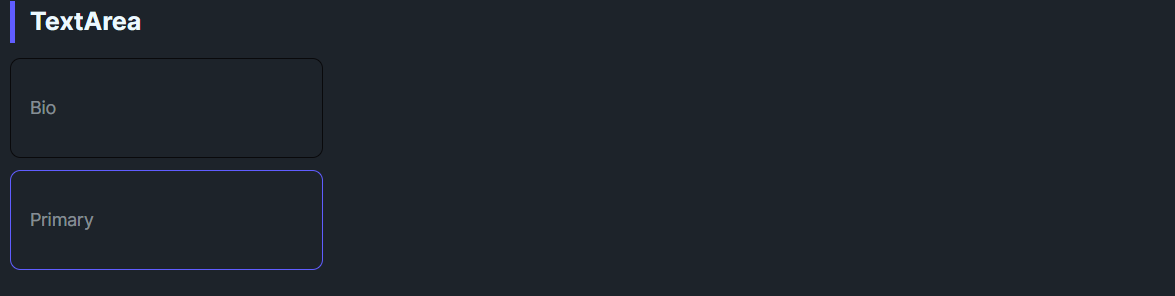
<controls:DaisyTextArea Label="Bio" IsRequired="True" Watermark="Tell us about yourself..." MinHeight="100" />
<!-- With helper text -->
<controls:DaisyTextArea Label="Feedback" HelperText="Your feedback is useful for us." Watermark="Type your feedback here" MinHeight="80" />
<!-- Character counter with max length -->
<controls:DaisyTextArea Label="Message" ShowCharacterCount="True" MaxLength="200" Watermark="Type here..." MinHeight="80" />
<!-- Auto-growing textarea -->
<controls:DaisyTextArea IsAutoGrow="True" Watermark="This textarea grows as you type..." MinHeight="60" />
<!-- With action button -->
<controls:DaisyTextArea Label="Feedback" ActionButtonContent="Submit Feedback" ActionButtonCommand="{Binding SubmitCommand}" Watermark="Type your feedback here" MinHeight="80" />
<!-- Validation states -->
<controls:DaisyTextArea Variant="Error" HelperText="Please provide valid input" Watermark="Invalid input" MinHeight="80" />
<controls:DaisyTextArea Variant="Success" HelperText="Looks good!" Watermark="Valid input" MinHeight="80" />
<!-- Filled variant -->
<controls:DaisyTextArea Variant="Filled" Watermark="Filled textarea" MinHeight="80" />MinHeight to provide enough room for content; allow wrapping instead of horizontal scrolling.Label for field names and Watermark for placeholder text.HelperText for validation messages; use ShowCharacterCount for character limits.IsAutoGrow="True" for comment fields where users may write varying amounts of text.ActionButtonContent to add inline submit buttons for feedback forms.HelperText to reinforce validation feedback.