DaisyNavbar
Overview
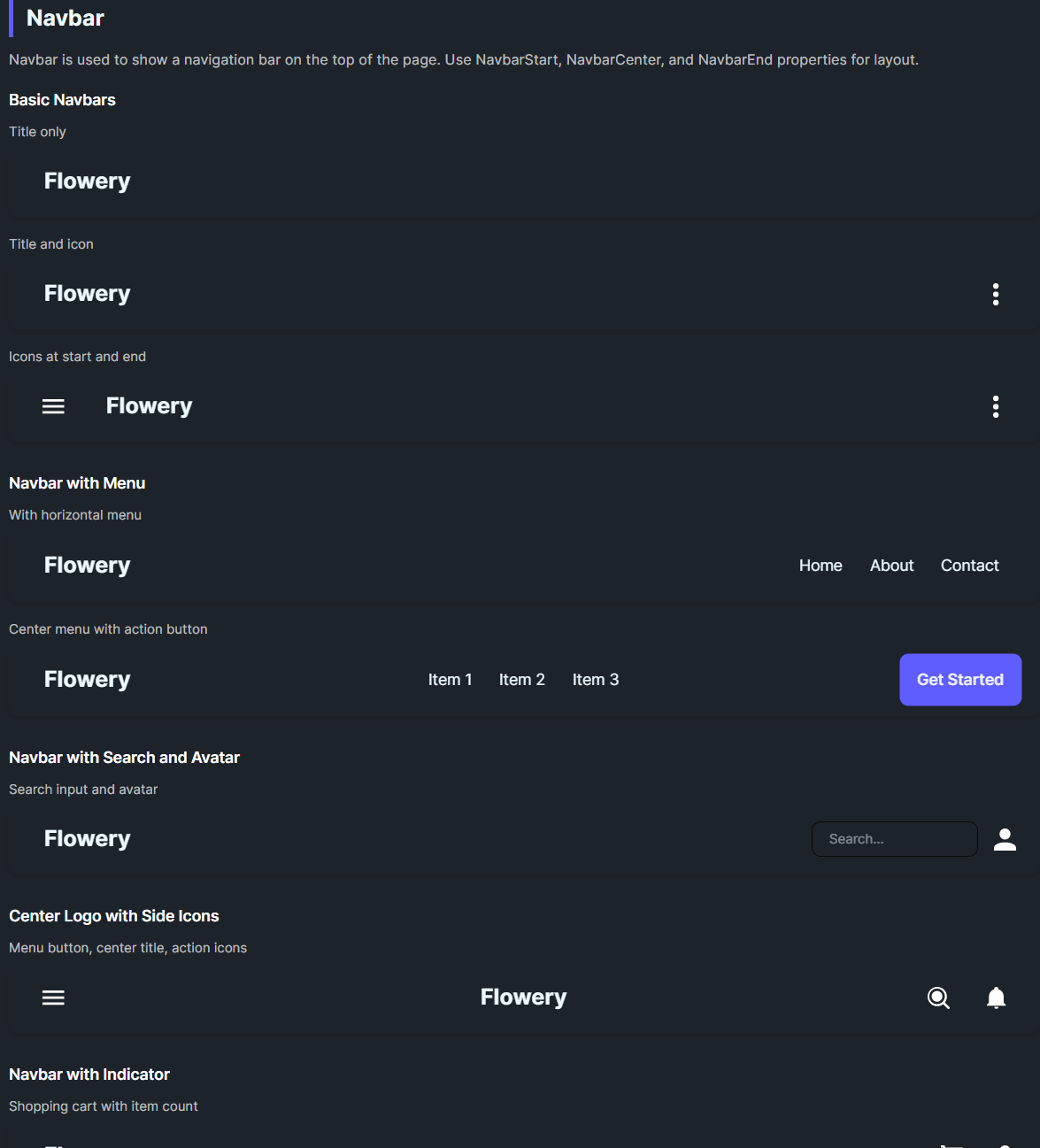
DaisyNavbar is a top navigation bar with optional start, center, and end slots. It provides padding, corner radius, and an optional shadow. If no slots are set, it renders its Content as a simple fallback. Use it for headers, app bars, or hero-top navigation.
Slots & Layout
| Slot |
Description |
NavbarStart |
Left section (fills half width, left-aligned). |
NavbarCenter |
Centered content (auto-sized). |
NavbarEnd |
Right section (fills remaining half, right-aligned). |
Content |
Used only when no slot content is provided (fallback). |
Appearance
| Property |
Description |
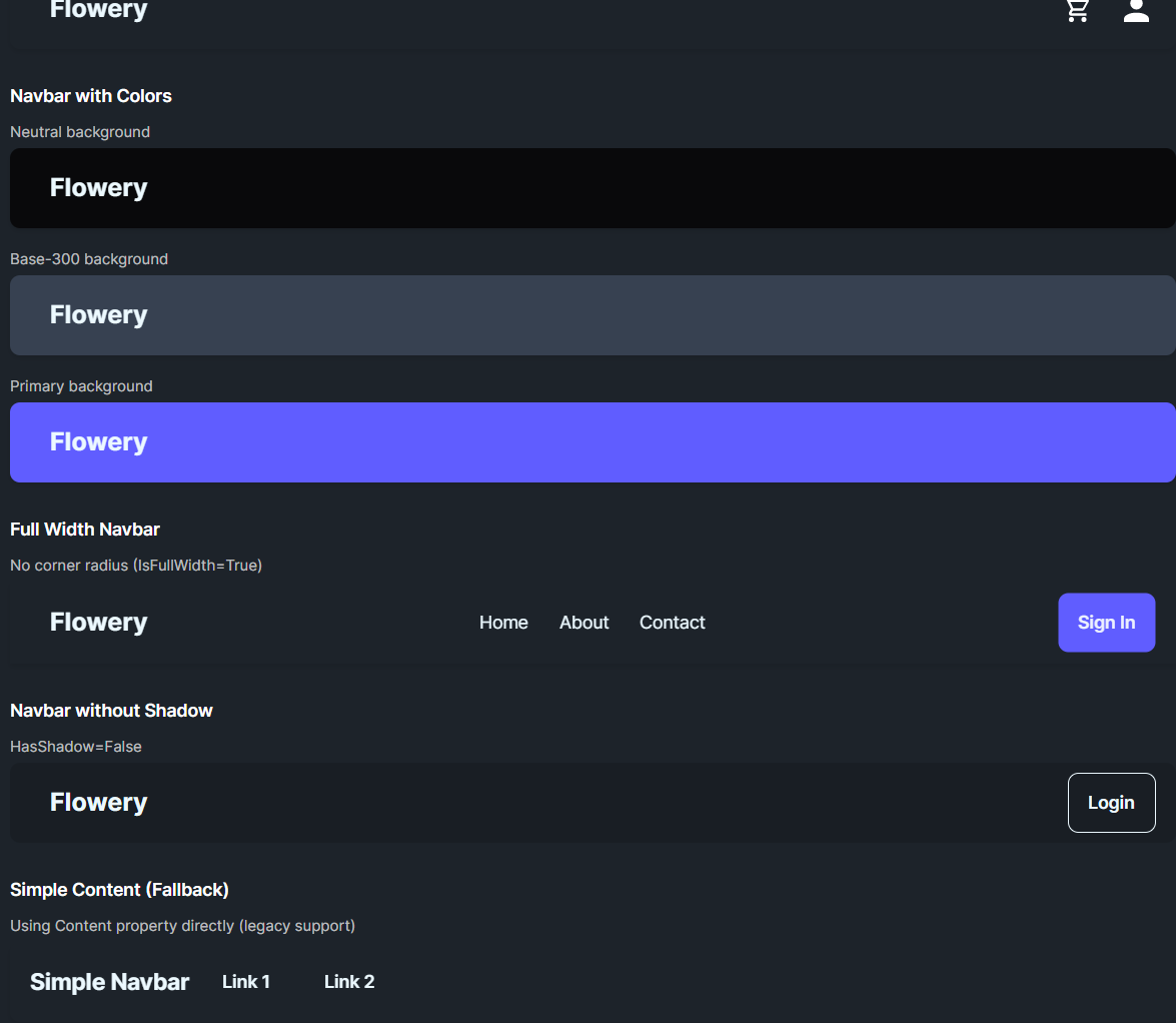
IsFullWidth |
Removes corner radius for edge-to-edge bars. |
HasShadow |
Toggles drop shadow under the bar. |
Padding / MinHeight |
Default 16,8 and 64 for comfortable touch targets. |
Quick Examples
<!-- Basic title only -->
<controls:DaisyNavbar>
    <controls:DaisyNavbar.NavbarStart>
        <controls:DaisyButton Variant="Ghost" FontSize="20" FontWeight="Bold" Content="Flowery" />
    </controls:DaisyNavbar.NavbarStart>
</controls:DaisyNavbar>

<!-- Full three-section navbar -->
<controls:DaisyNavbar>
    <controls:DaisyNavbar.NavbarStart>
        <controls:DaisyButton Variant="Ghost" FontSize="20" FontWeight="Bold" Content="Flowery" />
    </controls:DaisyNavbar.NavbarStart>
    <controls:DaisyNavbar.NavbarCenter>
        <StackPanel Orientation="Horizontal" Spacing="8">
            <controls:DaisyButton Variant="Ghost" Content="Home" />
            <controls:DaisyButton Variant="Ghost" Content="About" />
        </StackPanel>
    </controls:DaisyNavbar.NavbarCenter>
    <controls:DaisyNavbar.NavbarEnd>
        <controls:DaisyButton Variant="Primary" Content="Get Started" />
    </controls:DaisyNavbar.NavbarEnd>
</controls:DaisyNavbar>

<!-- Full-width bar without shadow -->
<controls:DaisyNavbar IsFullWidth="True" HasShadow="False">
    <StackPanel Orientation="Horizontal" Spacing="10">
        <TextBlock Text="Simple Navbar" FontWeight="Bold" FontSize="18" VerticalAlignment="Center" />
        <controls:DaisyButton Variant="Ghost" Content="Link 1" />
        <controls:DaisyButton Variant="Ghost" Content="Link 2" />
    </StackPanel>
</controls:DaisyNavbar>
Tips & Best Practices
- Use
HasShadow=False for flat layouts or when nesting inside elevated surfaces.
- Keep
NavbarCenter compact to avoid overlap with start/end sections on small widths.
- For responsive designs, collapse center links into a menu/drawer at narrow widths.
- Apply
IsFullWidth=True when the navbar touches screen edges; keep rounded corners for in-card navs.