
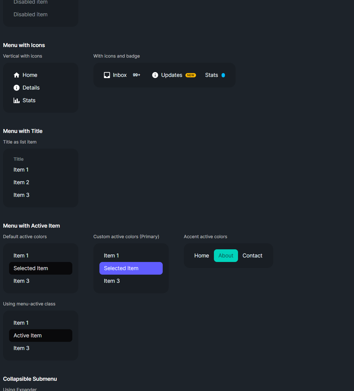
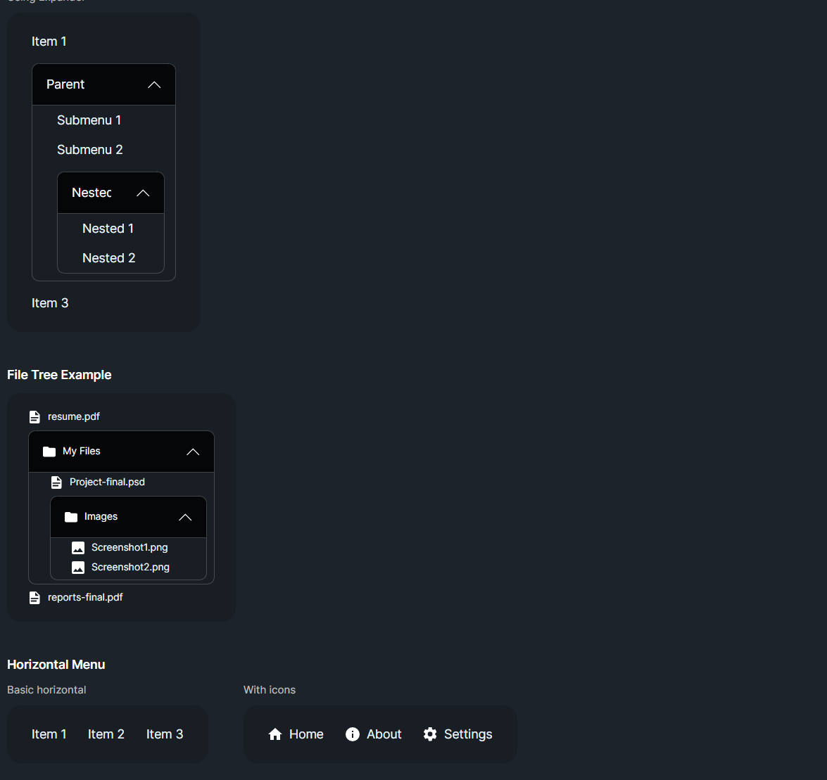
DaisyMenu is a styled ListBox for navigation menus. It supports vertical or horizontal layout, size presets, and customizable active colors for selected items. Submenus can be nested via another DaisyMenu or Expander. Use it for sidebars, nav bars, and contextual menus that need DaisyUI styling.
| Option | Description |
|---|---|
Orientation |
Vertical (default) or Horizontal. Horizontal enables horizontal scrolling if needed. |
Size |
ExtraSmall, Small, Medium (default), Large, ExtraLarge adjust padding/font on items. |
| Property | Description |
|---|---|
ActiveForeground / ActiveBackground |
Colors applied to selected items; defaults to Neutral theme colors. |
| Selection | Inherits ListBox selection; SelectedItem/SelectedIndex works as usual. |
<!-- Vertical menu -->
<controls:DaisyMenu Width="200">
    <ListBoxItem Content="Dashboard" IsSelected="True" />
    <ListBoxItem Content="Profile" />
    <ListBoxItem Content="Settings" />
</controls:DaisyMenu>

<!-- Horizontal nav -->
<controls:DaisyMenu Orientation="Horizontal" Size="Small">
    <ListBoxItem>Home</ListBoxItem>
    <ListBoxItem>About</ListBoxItem>
    <ListBoxItem>Contact</ListBoxItem>
</controls:DaisyMenu>

<!-- Nested submenu -->
<controls:DaisyMenu>
    <ListBoxItem Classes="menu-title" Content="Main" />
    <ListBoxItem IsSelected="True">Overview</ListBoxItem>
    <Expander Header="More">
        <controls:DaisyMenu>
            <ListBoxItem>Subitem A</ListBoxItem>
            <ListBoxItem>Subitem B</ListBoxItem>
        </controls:DaisyMenu>
    </Expander>
</controls:DaisyMenu>>- Use size presets to match surrounding controls; Small/ExtraSmall pair well with toolbars.
ActiveForeground/ActiveBackground to align with your brand colors if Neutral isn't desired.Classes="menu-title" for non-interactive section headers inside the menu.Expander for collapsible submenus; adjust margins for indentation as needed.