DaisyFab
Overview
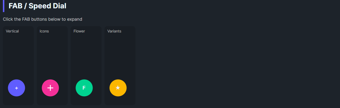
DaisyFab is a Floating Action Button container with built-in trigger and child action buttons. It supports Vertical stacking or Flower fan-out layouts, auto-closes when an action is clicked, and lets you customize trigger content, size, and variant. Ideal for exposing a small set of secondary actions from a single FAB.
Layout & Interaction
| Property |
Description |
Layout (Vertical, Flower) |
Vertical stacks actions upward; Flower fans actions in a quarter-circle. |
IsOpen |
Toggles the visibility/animation of action buttons. Trigger click flips this. |
AutoClose (default True) |
Clicking an action button closes the menu. |
Trigger Appearance
| Property |
Description |
TriggerVariant |
DaisyButton variant for the trigger (default Primary). |
TriggerContent |
Trigger content (default "+"). |
Size |
Propagated to trigger and action buttons (ExtraSmall–ExtraLarge from DaisySize). |
Quick Examples
<!-- Vertical FAB -->
<controls:DaisyFab TriggerContent="+" TriggerVariant="Primary" Size="Medium">
    <controls:DaisyButton Shape="Circle" Variant="Secondary" Content="A" />
    <controls:DaisyButton Shape="Circle" Variant="Accent" Content="B" />
    <controls:DaisyButton Shape="Circle" Variant="Warning" Content="C" />
</controls:DaisyFab>

<!-- Flower layout with custom trigger -->
<controls:DaisyFab Layout="Flower" TriggerVariant="Secondary" Size="Large">
    <controls:DaisyFab.TriggerContent>
        <StackPanel Orientation="Horizontal" Spacing="6">
            <PathIcon Data="{StaticResource DaisyIconPlus}" Width="18" Height="18" />
            <TextBlock Text="New" VerticalAlignment="Center" />
        </StackPanel>
    </controls:DaisyFab.TriggerContent>
    <controls:DaisyButton Shape="Circle" Variant="Primary" Content="1" />
    <controls:DaisyButton Shape="Circle" Variant="Accent" Content="2" />
    <controls:DaisyButton Shape="Circle" Variant="Success" Content="3" />
</controls:DaisyFab>
Tips & Best Practices
- Keep action count small (2–5) so spacing in Vertical/Flower layouts remains readable.
- Use
AutoClose=False if actions open modal flows and you want the menu to stay open.
- Prefer circular action buttons with concise icons/letters; labels belong in tooltips or surrounding UI.
- Position the FAB with layout (default bottom-right with margin 16) to avoid overlap with content.