DaisyBadge
Overview
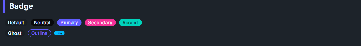
DaisyBadge is a compact label for counts, statuses, or tags. It supports 10 color variants, 4 size presets, and an outline mode for low-emphasis contexts. Works standalone or nested inside other controls (e.g., buttons, lists) to highlight small bits of information without overwhelming the layout.
Variant Options
| Variant |
Description |
| Default |
Neutral gray fill with contrasting text; fits most backgrounds. |
| Neutral |
Muted neutral tone for secondary tags. |
| Primary |
High-emphasis brand color. |
| Secondary |
Alternate brand color. |
| Accent |
Highlight color for special items. |
| Ghost |
Subtle neutral fill; minimal visual weight. |
| Info |
Informational blue tone. |
| Success |
Positive/confirming green tone. |
| Warning |
Cautionary amber tone. |
| Error |
Critical/destructive red tone. |
Size Options
| Size |
Approx. Dimensions |
Use Case |
| ExtraSmall |
12px height, 4px horizontal padding, 8px text |
Tiny dots/counts inline with text |
| Small |
16px height, 6px padding, 10px text |
Compact chips for dense lists |
| Medium (default) |
20px height, 8px padding, 12px text |
General-purpose badges |
| Large |
24px height, 12px padding, 14px text |
Emphasized tags or hero labels |
| ExtraLarge |
Falls back to medium metrics (no additional styling in theme) |
Outline Mode
| Property |
Effect |
IsOutline=True |
Makes the badge transparent with a colored border and matching text. Border/text color follows Variant (Primary/Secondary/Accent) or uses base content color for Default. |
Quick Examples
<!-- Basic badge -->
<controls:DaisyBadge Content="New" />

<!-- Color variants -->
<controls:DaisyBadge Content="Primary" Variant="Primary" />
<controls:DaisyBadge Content="Info" Variant="Info" />
<controls:DaisyBadge Content="Error" Variant="Error" />

<!-- Outline style -->
<controls:DaisyBadge Content="Outline" Variant="Primary" IsOutline="True" />
<controls:DaisyBadge Content="Ghost" Variant="Ghost" IsOutline="True" />

<!-- Sizes -->
<StackPanel Orientation="Horizontal" Spacing="6">
    <controls:DaisyBadge Content="XS" Size="ExtraSmall" />
    <controls:DaisyBadge Content="Small" Size="Small" />
    <controls:DaisyBadge Content="Medium" Size="Medium" />
    <controls:DaisyBadge Content="Large" Size="Large" />
</StackPanel>

<!-- Inside a button -->
<controls:DaisyButton Variant="Ghost" Content="Messages">
    <controls:DaisyBadge Content="5" Variant="Error" Size="Small" />
</controls:DaisyButton>

<!-- Placeholder/count style -->
<controls:DaisyBadge Content="+5" Variant="Neutral" IsOutline="True" />
Tips & Best Practices
- Choose outline mode when placing badges on colored surfaces to avoid heavy fills.
- Keep text short (1–10 characters) to maintain the pill shape and legibility.
- Pair
Info/Success/Warning/Error with matching semantic contexts (errors, confirmations, cautions).
- When embedding in other controls, pick a smaller size (Small/ExtraSmall) so the badge supports rather than competes with the parent.